iOS Redesign
Creating a more intuitive experience for the iOS and Android Voxer apps.
THE PROBLEM
Redesign the Android and iOS Voxer apps and launch a beta program to test and validate the new design and features.
CONSTRAINTS
1. The solution must be available on iOS and Android and have feature parity across old apps and new.
2. Release the new apps as a limited beta version.
3. Learn and iterate from customer feedback and beta testers.
THE TEAM
1. Product Designer - myself
2. Server Engineer
3. iOS Engineer
4. Android Engineer
GOALS
1. Incorporate user feedback from survey into redesign
2. Provide users with a more native experience
3. Use minimal branding to let the content pull forward
OVERVIEW
A survey was sent out asking for customer feedback and received a lot of constructive feedback. The findings from the survey were used to help guide the redesign. I worked with the client and server engineers to identify the technical constraints and limitations. Often, due to time constraints, a more limited v1 version was needed in order to help validate the ideas from beta testers as quickly as possible. One challenge was providing enough functionality in the beta app that users would feel comfortable using the app as a replacement for the original Voxer apps, while shipping as quickly as possible to get customer feedback for improvements.
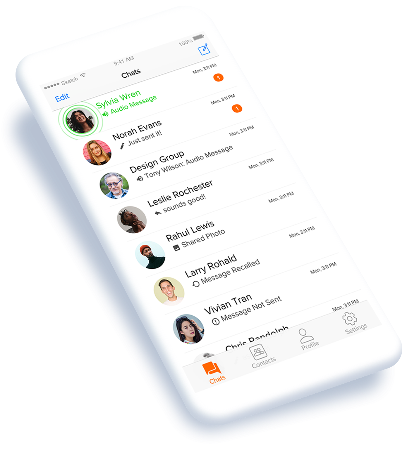
THE ORIGINAL APP
The diagram below shows the homepage of the original app with areas highlighted for improvement.
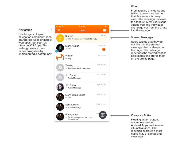
BOTTOM NAV
Users told us that the app “felt outdated” and that “the navigation was confusing”. I chose to implement a more native navigation pattern for iOS by using a bottom nav, based on the user feedback.
The Redesign
These images explore different bottom navigations for iOS. The right design was selected because it was the most intuitive to testers and used native patterns. The right design was selected because it was the most intuitive to testers and used native patterns, including the compose button for iOS.
AUDIO STATES
Audio is the core of the Voxer product. The goal with this redesign was to make the content the forefront and the app branding blend in the background. I did this by using a minimal amount of app branding and only when appropriate.
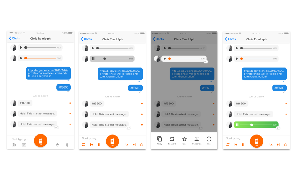
These images show the different audio states for receiving an audio message. Unheard, playing, long-press unheard, and receiving live audio.
EMPTY STATES
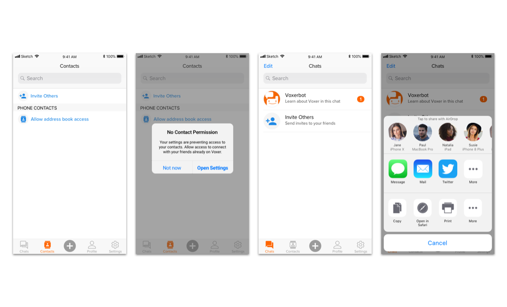
A collection of empty state screens.
TRANSCRIPTION
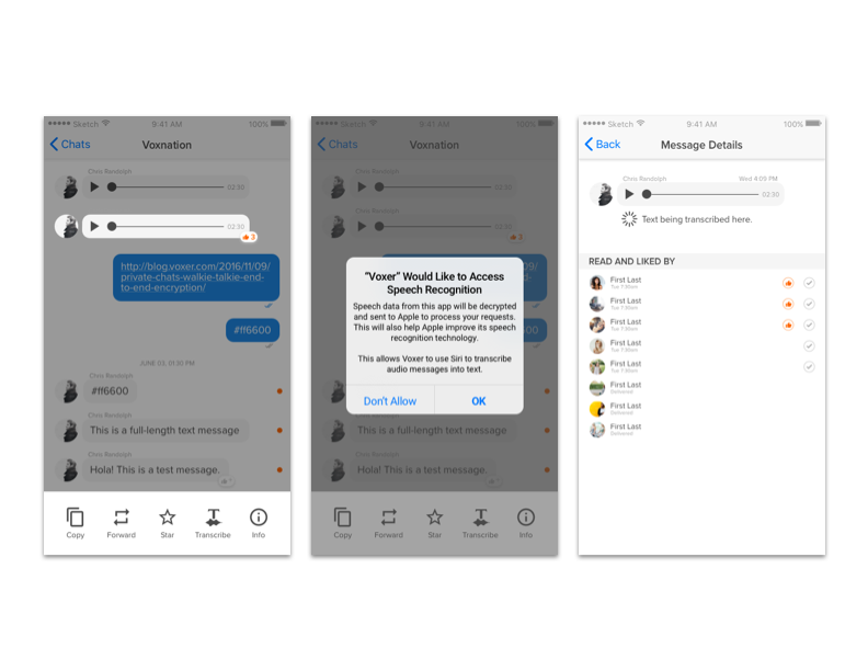
These screens show how one could go through the flow to transcribe an audio message into text.
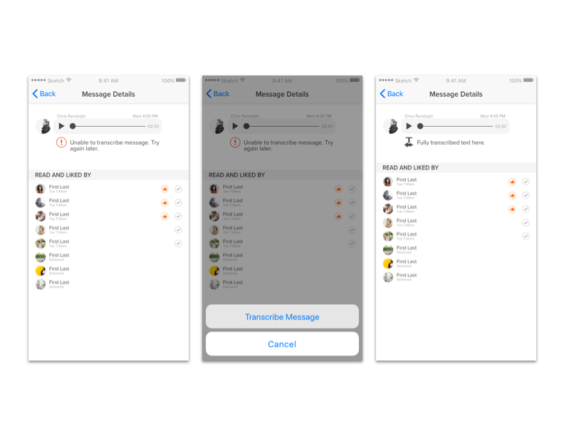
The error states for transcribing a message.
TEST & ITERATE
We sourced a group of beta testers and tested the app with them. Listening to feedback helped us validate the design and make improvements on the experience when needed.