Designing a seamless edit message experience
Enhancing user trust, improving clarity, and strengthening platform integrity across web and mobile
Overview
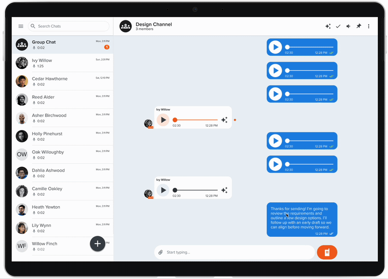
Voxer is best known for push-to-talk voice messaging but text is equally core to how users communicate on the platform. Text messages are where clarifications happen, context gets added, and issues get resolved in fast-moving team conversations.
But once a message was sent, it was permanent. Users had no way to fix a typo, correct a misstatement, or update information. In high-stakes conversations, by first responders, field teams, and business users, a wrong message left uncorrected created real confusion and eroded trust in the platform.
The problem
Without the ability to edit, users were forced into workarounds: sending correction messages ("ignore that last one"), flooding threads with follow-ups, or simply leaving errors in place. Each of these degraded the conversation experience.
- Typos and outdated information persisted permanently in conversation threads
- Correction messages added noise and disrupted conversation flow
- Users in high-stakes roles like logistics, first response, and field operations need reliable, accurate message records
- The absence of edit functionality was a commonly cited reason for user churn
Goals
BUSINESS
Improve user retention by removing a top-cited friction point. Strengthen platform integrity and trust for professional users.
USER
Allow users to quickly correct errors and update information without disrupting the flow or history of a conversation.
My role
I led end-to-end product design for the edit message feature and owned the UX strategy, interaction design, visual design, and engineering handoff. I worked closely with the CEO, Product Lead, and a Senior Engineer to define constraints, evaluate tradeoffs, and ship a solution that balanced user needs with platform trust.
Design process
Defining the right constraints
The core design challenge wasn't how to build an edit UI, it was how to define the right editing rules. Unlimited silent edits would create serious trust and fraud risks on a platform used in professional and high-stakes environments. We needed constraints that protected message integrity without making the feature feel punishing.
We evaluated three approaches:
The 15-minute edit window mirrors how people actually communicate with corrections happening immediately after a mistake, not hours later. The persistent "Edited" label preserves conversation accountability without making the edit feel punitive.
Designing the interaction
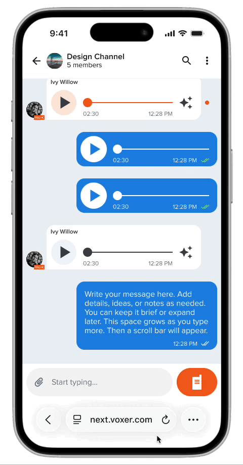
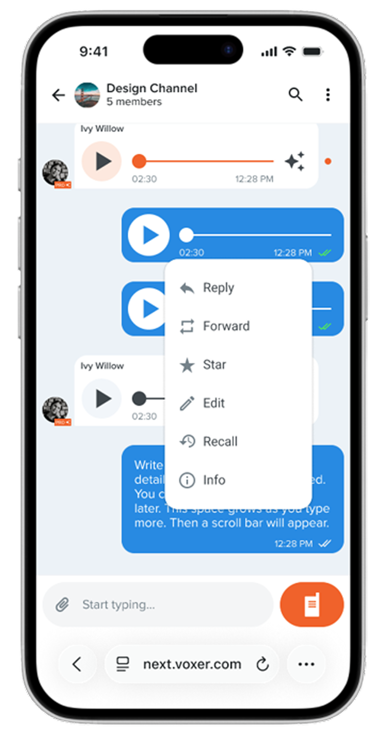
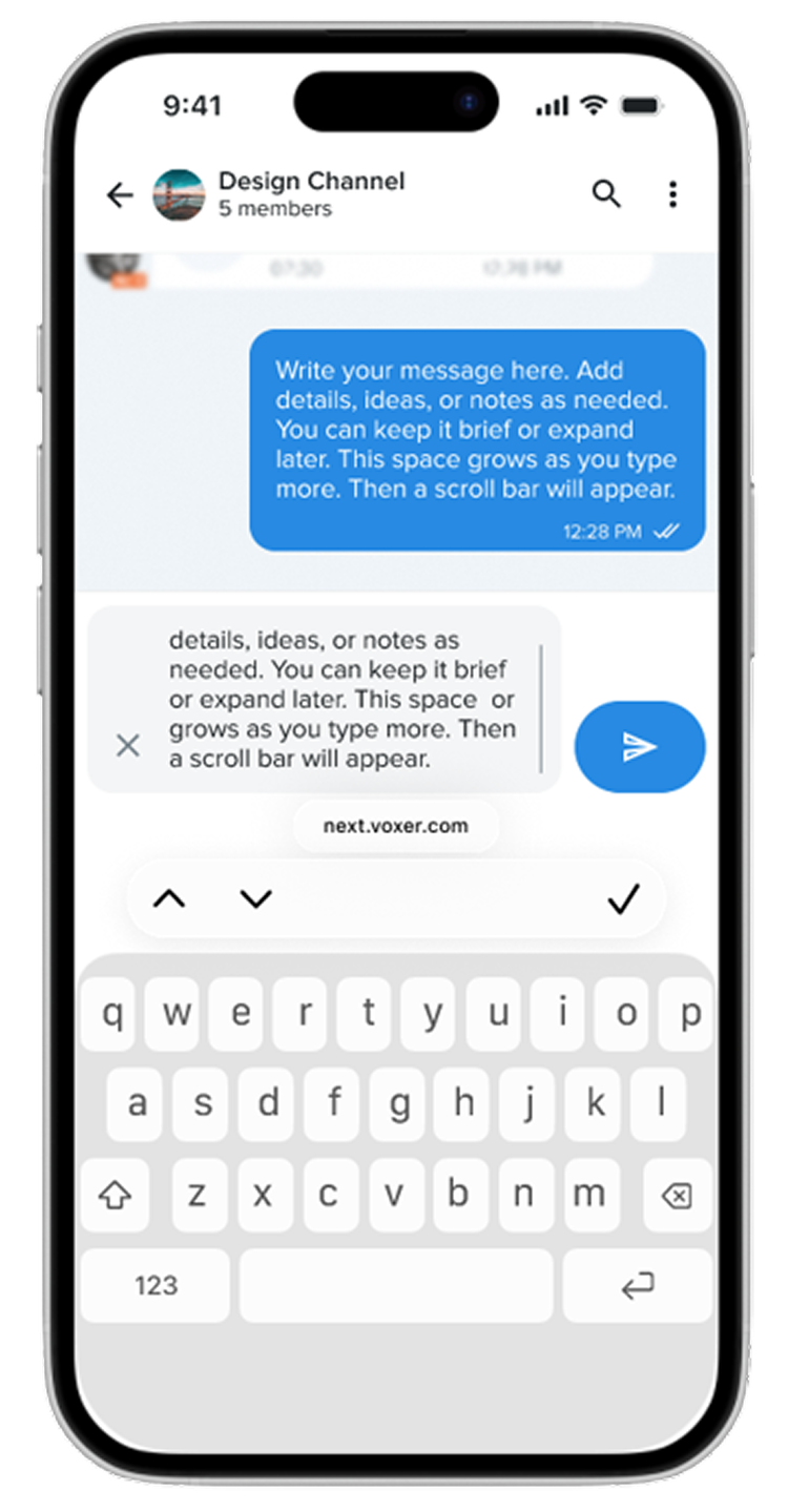
The entry point needed to feel familiar and discoverable without cluttering the message UI. I designed the edit trigger as a long-press action on the message maintaining consistency with existing platform patterns for message actions and leading into an inline edit state that kept the user in the conversation context.
Preserving trust through transparency
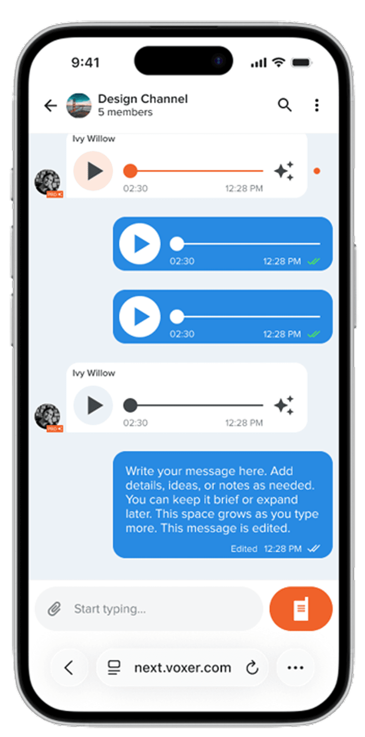
Every edited message displays a persistent "Edited" label visible to all participants. This was a deliberate decision to maintain conversation accountability — users on a professional platform need to be able to trust what they read. The label is subtle but permanent, ensuring no edit goes unacknowledged.
The design
The final edit message experience shipped across iOS, Android, and web with a consistent interaction pattern: long press to trigger, inline editing with a save/cancel action, and a persistent "Edited" label on the message after save. The 15-minute window is enforced silently by having the edit option simply disappear after the window closes.
Outcome
Edit Message shipped as a core platform feature and directly addressed one of the top user-requested improvements. The feature improved perceived platform reliability — particularly among power users in professional and team environments.
What I learned
A feature as seemingly simple as "edit a message" carries real implications for trust, accountability, and platform integrity. Getting alignment on the rules before designing the interface saved significant rework and produced a stronger outcome.
It also reinforced how much value there is in designing for edge cases early. The "Edited" label and the 15-minute window weren't afterthoughts they were the core design decisions that made the feature trustworthy enough to ship.